


Have you ever wondered if old charts might hold hidden secrets about the market? Diving into technical analysis, that’s just a fancy way of saying you’re using simple, time-based data to study market behavior, is a bit like getting a map that shows where prices have been and offers a hint about where they might go next.
It turns past trends into clear signals, making it easier to decide when to buy or sell. In a world where markets feel unpredictable, these charts give you a boost of clarity and a steady sense of confidence in every move you make.
Charting in Technical Analysis: Sharp Trading Clarity

Charting in technical analysis is a simple way for traders to see how the market behaves. It uses past price data, shown over time on a chart, to reveal trends, support levels (where prices tend to stop falling), resistance levels (where prices tend to stop rising), and the overall market layout. It’s kind of like drawing a map to navigate the twists and turns of market movements. One trader might say, "I use charts to see a price’s history, much like tracking the route of a road trip."
There are a few common types of charts you’ll come across. For example, a line chart draws a continuous line connecting closing prices, offering a clear view of how prices move over time. Bar and candlestick charts bring in more details by showing the opening, high, low, and closing prices, all in one view. This extra information can reveal how intense the price swings are, almost like reading the market’s mood. Then there are Renko and point-and-figure charts, which filter out minor moves and focus only on significant price changes. So if you spot a chart with brick-like patterns, you’re likely looking at a Renko chart.
What makes these charts so important is that they bring the market’s actions right in front of you. They help traders spot potential turning points and even hint at future trends by studying past behavior. Looking at clear patterns lets you see where the market is gathering strength or losing it. A trader might share, "The candlestick chart showed a reversal pattern, which was my signal to buy." Whether you’re just starting out or you’ve been trading for years, using these charts ensures that every decision is based on clear, hard data.
Overview of Major Chart Types for Technical Analysis

Line charts are a favorite among many traders because they help spot shifts in market momentum by letting you add trendlines and moving averages. One trader once mentioned that using a line chart allowed them to clearly see big turning points that raw data simply wouldn't show.
Bar charts are also key in technical analysis. They do more than show the open, high, low, and close prices. Skilled traders watch the size and spacing of the bars to figure out when the market might get volatile or break out. One experienced trader pointed out that when they see unusually large price ranges, they adjust their stops and take profits sooner, making it a handy tip beyond the normal bar chart details.
Candlestick charts bring market emotion into clear view. They let traders use patterns, like detecting engulfing or hammer formations, to decide on entering or leaving positions. A trader shared that spotting a long candlestick body followed by a doji made them rethink their position size, hinting at a shifting market mood.
Renko charts simplify things by cutting out minor price noise and focusing on big moves. Traders study the bricks on a Renko chart to judge trend strength and potential reversals. One case study explained that when bricks changed direction several times in a row, it signaled a possible trend end and triggered a timely exit.
Point-and-figure charts, which ignore time completely, are loved for their clear display of price movements. Traders use them to set exact points for entering and exiting trades based purely on price changes, without any distractions. One trader remarked that these charts help fine-tune market cycle patterns, making it easier to catch shifts as they happen.
Integrating Indicators and Overlays in Charting

When you add technical indicators to your charts, you turn plain numbers into friendly signals about where prices might be headed. Moving averages like SMA and EMA help smooth out the bumps in the data, making it easier to spot shifts in momentum. One trader shared, "I saw a clear trend change when the EMA crossed over the SMA, it was almost like the market was quietly hinting at its next move."
Volume bars below the price chart work like a quick pulse check, showing you how much buying or selling pressure is in the market. Then there are oscillators such as the RSI, which help you understand if an asset is too expensive or too cheap at that moment. The MACD also plays its part by using special averages to track shifts in momentum; when its lines cross, it's like getting a subtle alert that a trend might be about to change. Picture this: a sudden spike in volume happens at the same time as a MACD crossover, and you might just be looking at a strong signal to buy or sell.
Putting these tools right on top of your price chart helps you see the big picture. They confirm trends and even hint at reversals before the change fully sets in. Traders often watch for times when the price moves one way while an indicator suggests another, it could be an early clue that things are about to turn around. By mixing clear price visuals with smart indicators, you gain a sharper insight into the fast-paced world of trading.
Chart Pattern Identification and Trend Analysis Methods
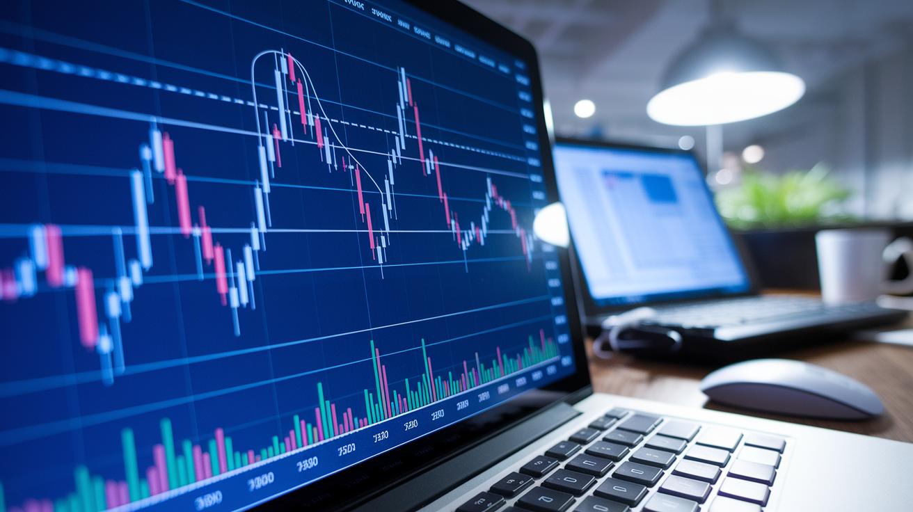
Chart patterns like head-and-shoulders, double tops or bottoms, and triangles often show up when traders react to big news such as interest rate changes. These patterns offer little clues about where asset prices might move next. For instance, a head-and-shoulders setup might mean the trend is about to shift, while a double bottom could indicate that support is getting stronger. Traders usually sort these patterns into two buckets: continuation patterns, where the trend might keep going, and reversal patterns, which hint at a potential flip in direction. (See "Technical Analysis Chart Patterns" – https://nftcellar.net?p=1394)
You can spot these patterns by simply looking closely at the charts, or by using automatic tools like Autochartist and platform scanners. Imagine looking at a candlestick chart and noticing a triangle forming over several sessions, it might mean the market is tightening up before it breaks out. On the flip side, automated scans can cover lots of assets quickly, helping you catch those signals without missing a beat.
Many traders also check how reliable these patterns are by looking at different timeframes and asset classes. Historical tests may show that certain patterns work better under specific conditions, though things can change with the market. This is why it's smart to keep an eye on pattern reliability and tweak your strategy with regular reviews and basic statistical checks.
Drawing trendlines is a key method in trend analysis. By connecting the high points or low points on a chart, you can map out the market's general direction and spot possible twists or steady moves. When you add in support and resistance levels, which mark spots where prices often bounce, it becomes easier to decide when to enter or exit a trade. For example, a trendline underneath a double bottom pattern might confirm a strong support area where prices could bounce back. All these techniques together give traders a better hand at predicting price moves and managing risk effectively.
Practical Trading Applications of Charting Techniques

Traders often rely on chart signals to guide their moves. They use step-by-step plans that make it easier to see when to buy or sell. For example, if the price jumps above a known resistance level on a daily chart, traders may see this as a clear buying chance. Similarly, by spotting gaps on charts, they can plan moves that often follow big overnight news, expecting prices to eventually fall back to previous levels.
Here's a common way to set up a trade:
- First, check a broader chart, like the daily or weekly view, to understand the overall market direction.
- Next, zoom into a closer view, like an hourly chart, to hunt for a good entry near a key support level or right after a breakout.
- Then, look for patterns, such as breakouts during periods of calm or gaps that match past moves, to make sure the current move fits previous trends.
- Set stop orders just below key pivot points or where lines join to help manage risk and keep your trade safe.
- Finally, adjust how many shares you buy based on how far your stop is placed and your comfort with potential losses.
Another helpful method is using charts from different timeframes. For instance, if you see the same breakout on both a daily and an hourly chart, it usually means the move is strong. By mixing these strategies and carefully managing stops, traders can better catch quick price moves while keeping sudden reversals in check.
Selecting Charting Software and Platforms for Analysis

When you explore charting tools like TradingView or MetaTrader 4, you'll quickly notice how interactive charts come to life with drawing tools, handy indicators, and backtesting features. These tools clearly show price changes so you can test strategies and notice trends as they happen. And if you’re always on the go, mobile apps let you keep track of forex pairs, cryptocurrencies, or stocks in real time.
Free charting tools are a solid way to get started, they give you basic charts and a few indicator overlays. It’s like dipping your toes in the water. As you learn more, you might upgrade to a paid plan that offers extra perks like automated scans, custom scripts, and the ability to export historical data. One trader even said, "I started out with a free platform and moved on once I saw how useful custom alerts and backtesting were."
Before you settle on a platform, think about what fits your trading style. Do you need easy-to-use drawing tools, or is a deep dive into past data more your speed? Prices can vary a lot, so choose one that gives you the right features for your budget. Try out demos or trial versions to see which one clicks. And if you’d like a detailed side-by-side look at different options, check out the review on Best Trading Platform.
Final Words
In the action, we walked through the basics of using charts to understand price moves and trends. We explored different chart types, learned how indicators can layer on data, and saw how recognizing patterns and market setups can lead to more confident decisions. We even looked at the best platforms and tools that make these tasks easier. Charting in technical analysis remains a friendly tool to clear up market mysteries, so keep practicing what you’ve learned and stay positive about your trading future.
FAQ
What is charting in technical analysis?
Charting in technical analysis means using visual charts to show price history. It represents trends, support, and resistance, allowing traders to spot patterns and make informed decisions.
What is the best chart for technical analysis?
Choosing the best chart depends on your trading style. Many traders favor candlestick charts because they clearly show price action and market sentiment in a concise visual format.
What is the 3 5 7 rule in trading?
The 3 5 7 rule in trading sets specific measures for entries, stops, and profit targets. It provides a structured approach to risk management, helping traders keep their losses in check and gains clear.
Where can I find free PDFs or downloads on technical analysis charting?
Free PDFs and downloads related to technical analysis charting are available online. These resources often cover chart construction basics, price action techniques, and step-by-step guides for beginners.
Are there examples of technical analysis charting or guides on reading stock charts for beginners?
Examples of technical analysis charting include clear, beginner-friendly guides that show how to read stock charts. They highlight key points such as open, high, low, and close prices, making the process accessible.