

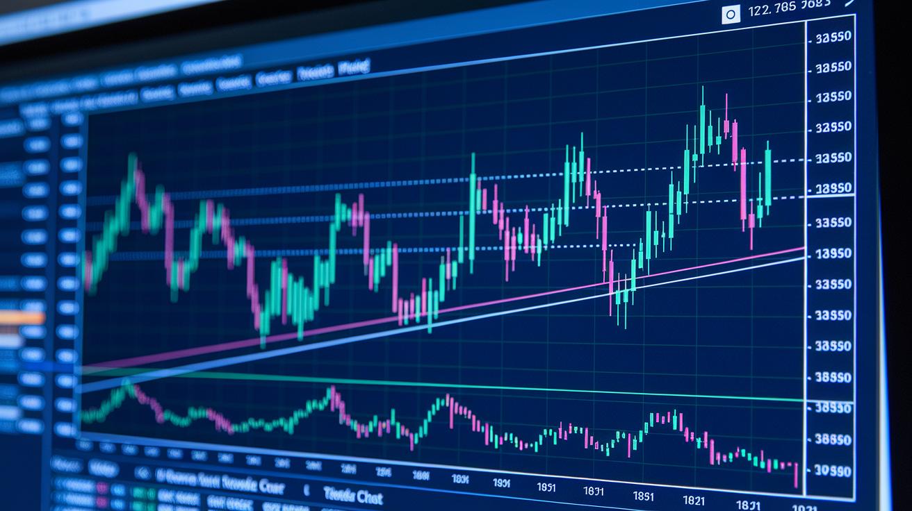
Have you ever noticed how a simple line can hint at where the market might be headed? Trendline analysis draws straight lines on candlestick charts (those are charts with little bars that show price changes) to show the tug-of-war between buyers and sellers. It turns a jumble of numbers into a clear path, making it easier to see where the market is moving. In this post, we explain how these basic tools turn scattered price points into a story of control and movement, giving you a straightforward view of market trends.
Understanding Trendline Analysis in Technical Analysis

Trendline analysis is a handy tool that traders use on candlestick charts to keep an eye on key price points. It’s all about drawing straight lines to connect important highs or lows, showing who’s in control, buyers or sellers. Think of it like sketching a simple roadmap that hints at the market’s direction.
In an uptrend, the trendline touches on higher and higher lows, almost like a floor that stops prices from falling too much. On the flip side, in a downtrend, the line runs along lower highs, acting like a ceiling where sellers push prices down. For a trendline to really count, it should link at least two major points, and if you see three or more touches, that line gets even more trustworthy.
Traders watch how prices react around these lines to get a feel for market momentum. By spotting how prices bounce off these diagonal barriers, they can guess if an uptrend or downtrend is likely to stick around or maybe even reverse. This simple yet powerful method helps in deciding when to enter or exit a trade.
Trendline Drawing Techniques for Accurate Charting

Getting your trendlines just right can really change how you read the market. Even a tiny mistake can throw off your view and make it tricky to decide when to jump in or out of a trade. When your plot points are spot on, you not only read the chart better but also see the market clearly, which boosts your confidence in trading.
Start with a simple plan. Focus on important highs and lows using longer time frames, which smooths out the random noise and shows you the real trend. By linking two or more key points, whether it’s rising lows in an upward trend or falling highs in a downtrend, you build a line that supports your analysis visually. Sometimes using the candle wick (that little tail on a price stick, showing extra detail) instead of just the body can give you a bit more accuracy, especially during small fluctuations.
- Use higher time frames for clear insights.
- Pick consistent price points (decide on wick or body).
- Make sure your line hits at least two valid points.
- Don’t force the line to include irrelevant extremes.
Keep in mind that markets change fast. Check and update your trendlines regularly as new data comes in. Staying on top of your charts means you can spot key signals as soon as they appear, helping you keep up with the market’s pace.
Graphical Slope Analysis and Trendline Validation

The slope of a line can really show you if a market trend is here to stay. If you notice a steep trendline, it might mean prices are racing ahead, so fast that the trend could suddenly falter. But if the slope is shallow, it often indicates that the market is moving sideways rather than charging up or plummeting down.
Measuring the angle correctly gives you a clear picture of whether the trend is strong or losing momentum. For a trendline to be reliable, it should get touched by price at least three times on the chart. This extra check boosts your confidence and helps sift out any false signals.
| Slope Angle | What It Tells You |
|---|---|
| Steep (>60°) | Trend may not last |
| Moderate (25–60°) | Solid trend movement |
| Shallow (<25°) | Market likely drifting sideways |
Checking for several touches on the trendline is a smart way to validate its strength. When you see a trendline in one of these slope categories and it gets hit three or more times, it sends a clear visual signal that the trend is holding firm. This method makes slope measurements and trend checks a dependable tool in technical analysis.
Trendline Breakout and Reversal Strategy Signals

Watching price action and volume is key when you're looking for trend breaks. When the price steps over a big trendline and volume suddenly spikes, it can signal that the market is ready to break out or reverse. It's a bit like seeing a flare in the distance, suddenly, everything seems charged with new energy. For example, you might see a stock push past its trendline while trading activity surges, hinting that things might be about to change. Picking up on these early clues helps you plan your next move more clearly.
- Look for the trendline to be broken along with a boost in volume.
- Wait until the price tests that broken line to be sure of the breakout.
- Use another tool, like RSI or MACD, to double-check the signal.
- Once you’re confident in the reversal, decide whether to enter or exit your position.
Risk management is just as important as spotting the initial signal. Even if a breakout seems solid and the volume backs it up, you have to guard against false alarms. That’s why I always set stop-loss orders and adjust position sizes, to protect my money if the market suddenly turns. Using a mix of technical tools instead of relying on one can really keep you on safe ground. Stay alert to sudden shifts and be ready to step back if the trendline stops holding. That extra bit of caution might just save you from a costly mistake.
Channel Construction Methods Versus Single Trendline Analysis
Building a trading channel is a bit like drawing two matching lines that mark where price has repeatedly bounced. One line traces the swing lows, while the other follows the swing highs. This approach clearly shows where buyers and sellers have met before, offering a more complete look at the market than just one sticky trendline.
When you use a single trendline, you only see one side of the story, either support or resistance. But with channel analysis, you get both the bottom and the top limits. It’s a simple way to spot where prices might bounce or break out, giving you a fuller sense of how market forces are playing out.
And when the market gets choppy, these channels become super handy. As prices hit new highs and lows, traders adjust the lines to keep pace with the action. This flexibility keeps the channel reliable, helping you stay in tune with ever-changing market vibes.
Overlay Techniques and Confirmation Tools in Trendline Analysis

Overlay techniques add extra layers of confirmation to the basic signals you see in trendline analysis. Traders often mix in moving averages and Fibonacci tools, simple methods that use key math numbers, to better understand where the market is headed. These overlays pop up on candlestick charts to help smooth out the regular ups and downs, making the signals more reliable even when prices are bouncing all over the place.
Placing these extra visuals over your usual trendlines can uncover hidden patterns during quick market changes. It’s a bit like comparing old photos with what’s happening right now, making it easier to catch trends at a glance.
But don’t forget the importance of confirmation tools. For example, when you look at a candlestick chart, a small wick push might be okay as long as the main body of the candle stays in line. Tools like the RSI, a simple gauge of market momentum, can further back up what your trendlines suggest. This means you can tell genuine market shifts from those brief, random moves.
In short, combining overlay techniques with solid confirmation tools creates a stronger setup for your trades. This balanced approach cuts down on guesswork and helps manage risk, giving you a clearer picture of the market’s true direction.
Real-World Trendline Analysis Case Studies and Pattern Recognition

Looking at the SPY chart, you can spot a clear uptrend built on a sturdy trendline. When a drawn line touches three key support points along rising lows, it tells you that buyers are consistently back in the game. Each touch isn’t just a one-off bounce, it shows a real, lasting strength that traders love as a cue to jump in.
Now, consider the EUR/USD pair. Sometimes, the price hangs around a well-established trendline until it finally breaks out. When the price nears a tough resistance area and struggles a bit, then a MACD crossover aligns with a big surge in volume, that moment stands out. It’s like the market saying, “Watch out, I’m changing direction,” which prompts traders to tweak their strategies.
Then there’s the classic head-and-shoulders pattern. Imagine a high peak (the head) sandwiched between two lower peaks (the shoulders). When the price dips below the connecting trendline, it hints at a full reversal. Spotting this setup helps traders get ready for a drop, mixing solid technical analysis with real-world trading action.
Final Words
In the action, we broke down how trendlines mark key price points and support smart moves. We covered drawing techniques that keep your charts clear, slope checks for spotting trends, and breakout signals that guide your entries and exits.
We also compared channel formation with single trendlines, and showed how overlays and real-world case studies make these insights come alive. This blend of trendline analysis technical analysis empowers you to dive into the markets with fresh confidence.
FAQ
Q: What is a trend line in technical analysis?
A: A trend line shows market direction by connecting key highs or lows on a graph. It highlights support in rising trends and resistance in falling trends to help with trading decisions.
Q: What types of trend lines are there?
A: The types of trend lines include uptrend lines that mark support and downtrend lines that mark resistance. They are drawn by linking major price points along a chart.
Q: How is trend analysis used in technical analysis?
A: Trend analysis uses drawn lines on charts to gauge market movement. It helps traders spot bullish or bearish patterns by reviewing how price reacts to these directional lines.
Q: How do you draw trendlines in technical analysis?
A: Drawing trendlines involves linking at least two significant highs or lows with a straight line. Using higher time frames and consistent price points, like candle wicks or bodies, can improve accuracy.
Q: What is the 3-5-7 rule in trading strategy?
A: The 3-5-7 rule is a guideline for gauging trendline strength. It suggests confirming a trendline when the price touches it three times, then monitoring pattern stability over five and seven periods.
Q: Can you provide an example of trendline analysis in technical analysis?
A: An example is drawing a line through successive swing lows in an uptrend, which then acts as a support line. This helps traders decide on entry or exit as prices repeatedly bounce off this line.
Q: Are there guides like PDFs available for mastering trend lines and trading strategies?
A: Yes, PDF guides on mastering trend lines and trading strategies offer detailed explanations, examples, and instructions on drawing techniques and reading market patterns for effective trading.